Shady Lane Portfolio Build
Running a small production team of AI agents as one person, from design system to deployed site.
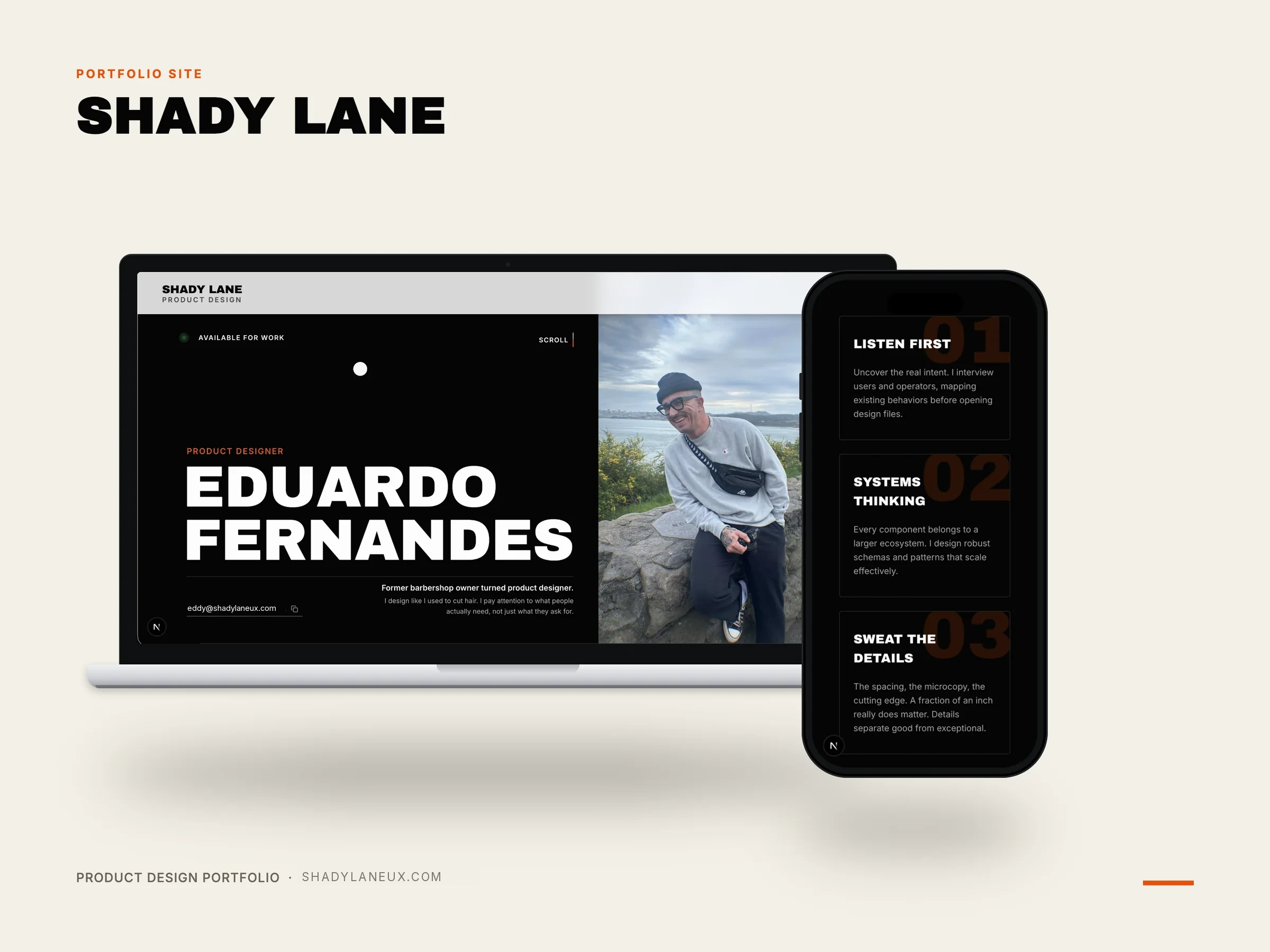
Shady Lane started as a static design in Figma, frozen into a formal token system, then carried through implementation into a live, coded, deployed site. AI was part of every stage of that process. Not as a shortcut, but as a way to work faster without cutting the parts that usually get cut under time pressure: verification, iteration, polish.
This case study walks through that process end to end, from a frozen Figma file to a live product, and what AI actually changed along the way.
The early version of this portfolio read like most junior portfolios: design skills, tools, project summaries. Competent, but forgettable, nothing that explained why someone should remember it after reviewing dozens of similar sites.
Fixing that meant rethinking the whole approach: fewer projects, told with more depth. The portfolio became a designed system rather than a list of screens, deserving the same craft as the work inside it.
Two shapes a portfolio can take
The usual shape
- Skills
- Tools
- Project summaries
- A list of screens
The rethink
- Fewer projects
- Told with depth
- Same craft as the work
- A designed system
The two tracks end as different things, which is the whole reason for the rebuild. One is a list of screens, the other is a system built with the same care as the work it contains.
The design phase came first and stayed contained. Color, type, spacing, and elevation were built into a formal token system in Figma: not just chosen but named, documented, and audited until nothing shipped that wasn’t a confirmed decision. Building it this way, as a reusable system rather than a single set of choices, is what makes it portable to a client project. The same structure holds for any brand, because the discipline is in how the system is built, not the values themselves.
That discipline pays off directly in code. Implementation translated the token system straight into production values. Every color, spacing, and type decision was already made and named before a line of code existed: nothing derived again, guessed at, or decided ad hoc midway through the build. That’s what actually shortens a coding timeline: not writing code faster, but removing the decisions that would otherwise get made, or missed, during implementation.
Define Tokens
Colour, type, spacing, elevation
Audit The System
Nothing ships unconfirmed
Translate To Code
Tokens become production values
Ship It Live
Next.js, Tailwind, Vercel
A few moments stand out. A muted footer text color needed real contrast math against a background that is almost black, not a visual guess. Running the calculation caught a genuine accessibility problem before it shipped. A toggle icon built on the exact same timing as a set of nav links still read as noticeably slower once it was actually moving. No spec comparison would have caught that. Only watching it move did.
AI made that kind of iteration fast enough to actually do properly. Testing a change, watching it, adjusting, and testing again took minutes rather than a much slower manual cycle. That’s what let the small decisions that make a site feel considered actually get made, instead of skipped for time.
On paper · In practice
A muted footer text colour
On paper
Looked acceptable against a ground that is almost black.
In practice
Running the real contrast math, rather than trusting the eye, caught a genuine accessibility failure before it shipped.
A toggle icon and the nav links
On paper
Identical duration and easing values, matching on paper.
In practice
The toggle still read as noticeably slower once it was actually moving. No spec comparison catches that; only watching it does.
Both of the moments described above. Neither was visible in a specification. Each needed the thing measured, or watched, once it was real.
Most design portfolios end at the Figma file. This one didn’t, because the process wasn’t finished until it was actually live. A full token system was built and audited against Figma, then implemented as a real, deployed site on Next.js, Tailwind, and Framer Motion.
Production carries its own category of problems no Figma file prepares anyone for. A build silently hung with zero errors, traced to a Node.js version conflict. A deployment kept failing for reasons invisible in any log, traced to a mismatched Git identity being silently rejected. None of these are design problems. They only show up when you actually ship something.
The system, rendering itself
Colour
Spacing
- 14
- 28
- 312
- 416
- 524
- 632
- 740 exception
- 848
Radius
Motion
- fast
150ms - normal
400ms - slow
600ms
Rendered from lib/tokens, the same source the components import, not a screenshot. Editing a token changes this specimen, which is the only way a system diagram stays true. Six colours of fourteen, eight spacing steps of twelve; the full set covers colour, spacing, type, radius, shadow and motion.
The token system built for this project isn’t specific to it. The structure is the same discipline that carries into a client project with a completely different brand, colors, and type. Tokens are named and documented rather than just chosen, and values are audited against one source of truth. That portability is what makes the process repeatable, not just fast once.
On top of that structure, AI closes the gap between designed and shipped, the place where scope usually quietly shrinks. Motion gets simplified, edge cases get skipped, and the polish pass never happens because there isn’t time. A verified system paired with a faster iteration loop means a client gets more finished, more considered work in the same time available. Not a designer who also happens to know some AI tools.
Case study page weight
19.4 MB1.07 MBVans page on a 375px viewport. Two videos were rendered across six elements; the hidden breakpoint copies downloaded too.
Hero image on a phone
1.32 MB309 KBThe hero bypasses next/image because WebGL consumes it as a texture, so responsive variants were generated by hand.
Reveal gestures
1 used 96×496 of 104 reveals were the same fade and rise on one easing curve. Now assigned by material: type, media, rule, label.
Animation dependency
38 files22 filesFramer Motion retired from every scroll reveal in favour of GSAP, already present for the pinned sections.
Visible focus states
0 of 1414 of 14No element on the homepage showed a focus ring, and a custom cursor hid the pointer on top of that.
Contrast failures
150Measured on this case study page against each element's real backdrop, at WCAG AA for its own size and weight.
Every figure measured on this site. The before column is an earlier build of the same pages. This is what directing the work produced, not work delivered for a client.
I’d separate static design and motion earlier and more deliberately. Leaving motion out of Figma entirely and documenting it as reference values instead turned out to be the right call. It took some trial and error to arrive at, though, rather than being the starting assumption.
I’d also build a clear reference document, of decisions, fixes, and conventions, from the first session instead of partway through. None of that changes what shipped. A considered workflow beats a fast one that keeps needing to be redone. AI makes the considered version finally possible on a timeline that used to only allow for the fast one.