Curaleaf Ecommerce Redesign
Improving product discovery and promotional visibility for one of the country's largest cannabis retailers.
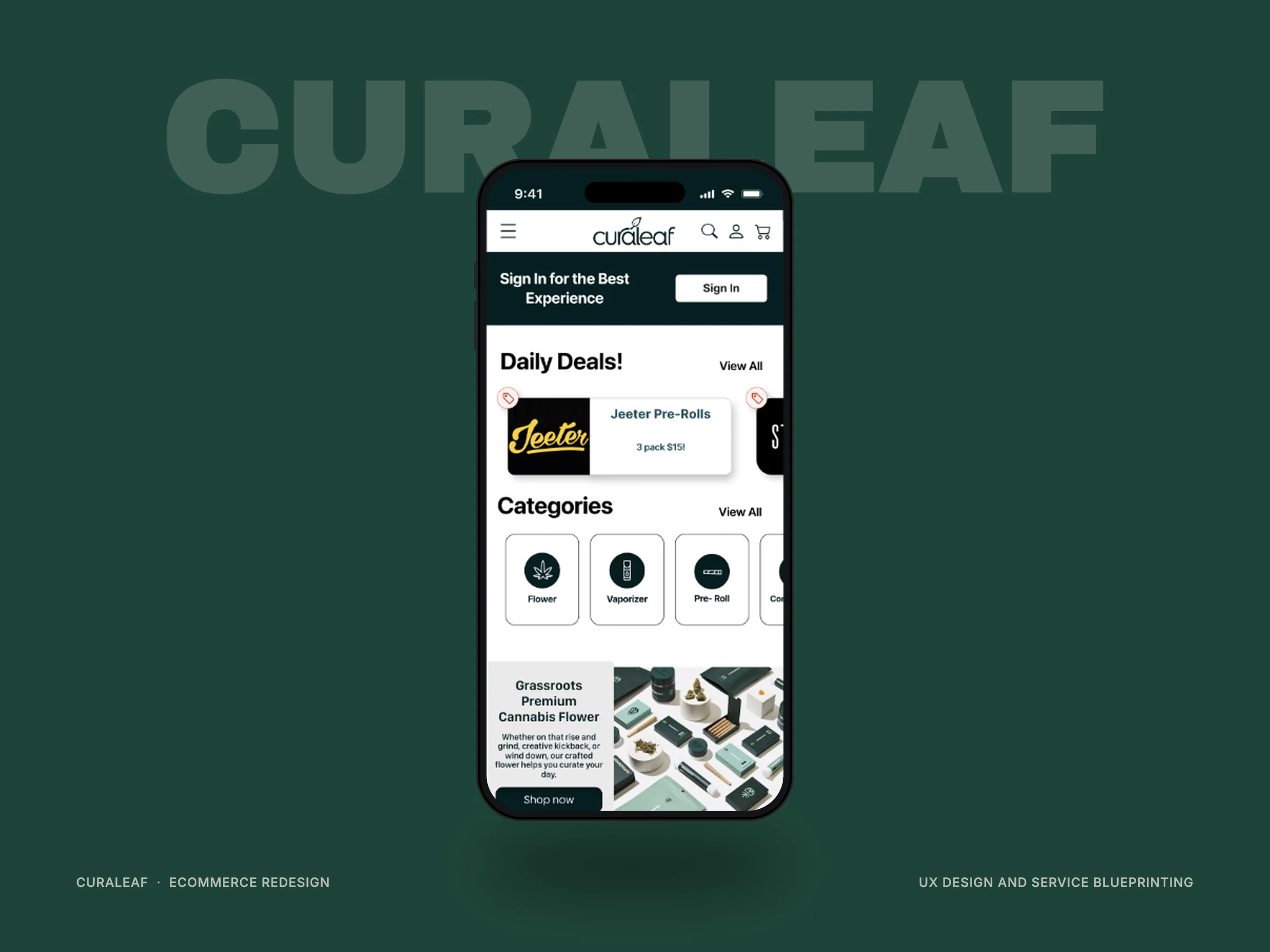
Curaleaf runs one of the largest cannabis ecommerce operations in the country. But like most digital shoppers, their customers get distracted, forget what they came for, and abandon carts before completing a purchase.
With online orders accounting for roughly a quarter of dispensary revenue, improving product discovery and promotional visibility represented a meaningful opportunity for both customers and the business.
Two issues kept surfacing. Customers struggled to quickly find the products they were looking for, and promotional content introducing new products often went unnoticed.
The challenge was improving both experiences without adding clutter or distracting from the shopping journey.
Before redesigning anything, I sat down with Luke Flood, Curaleaf's Senior Vice President and West Regional Leader, to understand where customers were actually leaving.
Online ordering, he explained, had become central to how customers shop. Many check availability before ever stepping into a store. But the mobile experience was inconsistent: slow to load in places, with menus and buttons that weren't always easy to use on a phone.
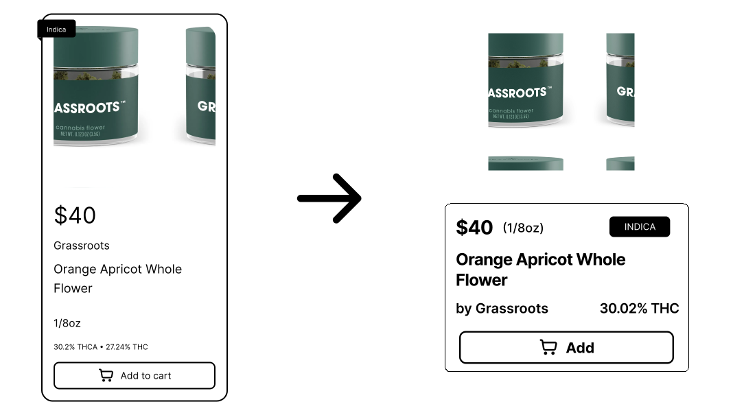
Because customers struggled to locate products quickly, I redesigned the product card to surface pricing, potency, and category information more clearly, and condensed adding to the cart into a single tap.
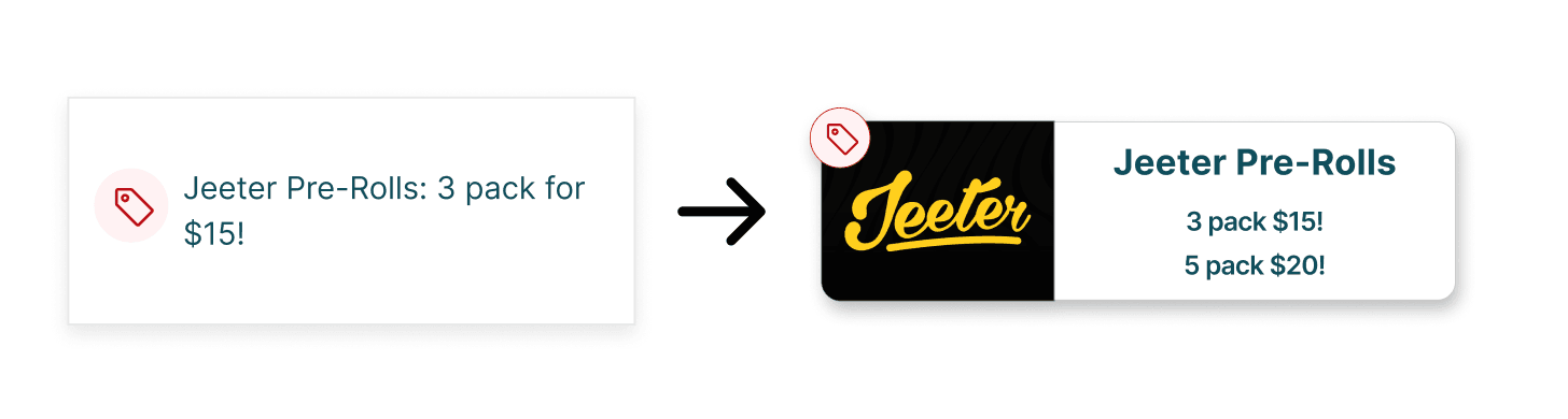
Redesign sale item card
- Add brand image
- More contrast on red ticket icon
- Adjust cards to fit multiple lines of text

Redesign product card
- Condense product info/add to cart button
- Place product image outside of border
- Lighten border stroke and add drop shadow
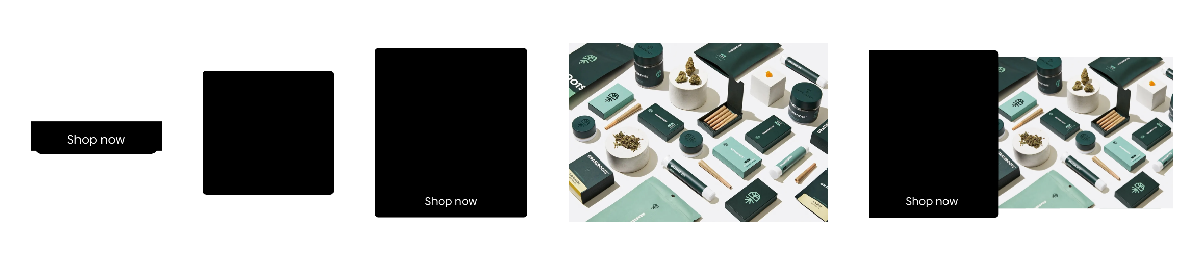
Promotional Banners
- Promo placement with stronger contrast
- Swipeable carousel for new products
- Consistent sizing across categories
I tested the redesign with five participants between the ages of 21 and 40, including a mix of new and returning cannabis consumers. Testing focused on product discoverability, promotional visibility, ease of navigation, and overall confidence while shopping.
Order completion still averaged around 8 minutes, pointing to a secondary issue: a cluttered category structure slowing product discovery even with a clearer promo experience.
I would gather baseline metrics before testing, so results could be measured by comparing before and after. I would also validate the information architecture with a larger group, and explore how personalized recommendations could support returning customers.
The project reinforced something I continue to believe: the best ecommerce experiences don't ask customers to work harder. They quietly remove friction and help people find what they need with confidence.